
The new Recon just got sharper
Refreshed design for core pages
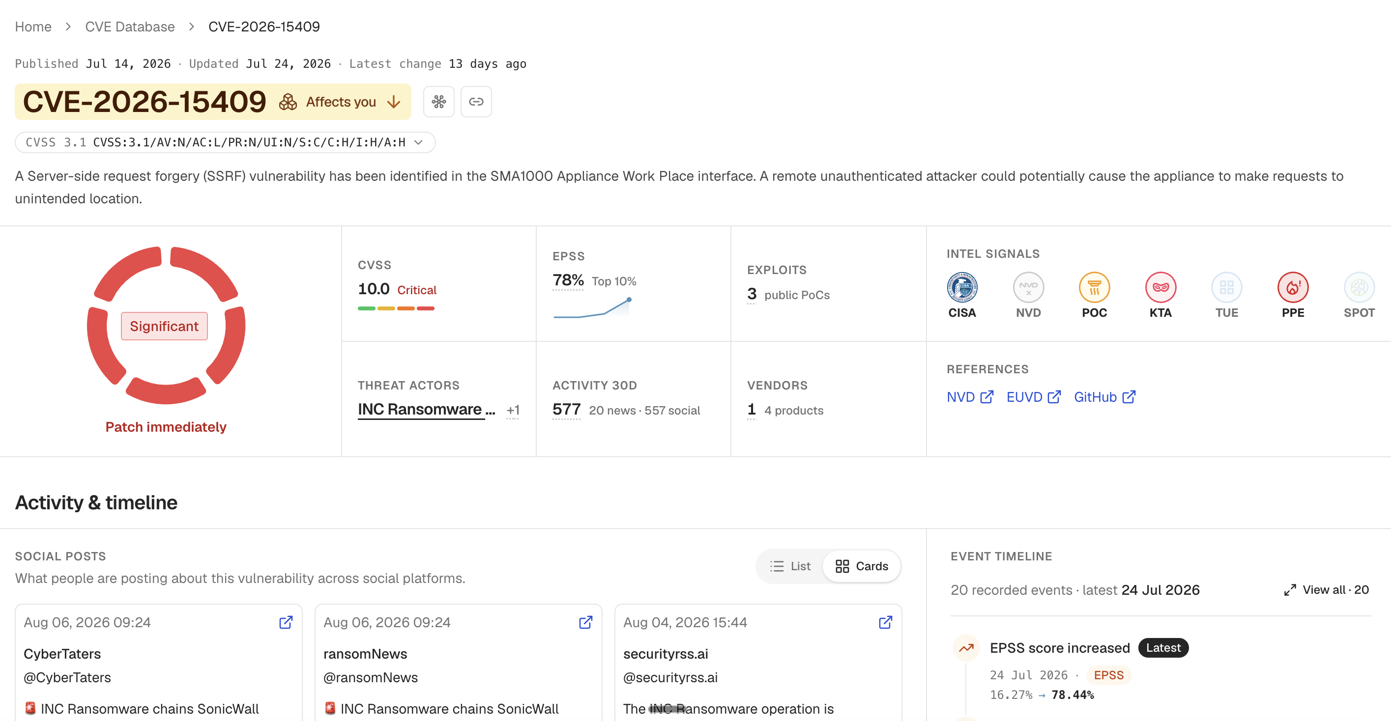
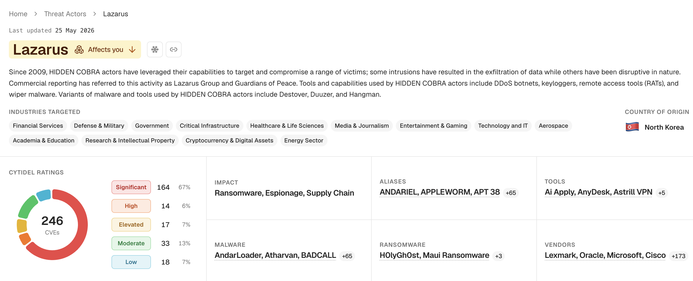
Based on your feedback, we've refined Recon's UI and redesigned the core pages, starting with CVE details and threat actor details. Clearer hierarchy, less visual noise, and information laid out in the order you actually work through it — easier to digest, faster to scan, and built to scale as we keep adding intelligence to every page. Your own context is called out right at the top, too: anything relating to your inventory is flagged with 'Affects you' before you've read a single line. Beyond the headline pages you'll notice plenty of smaller refinements — spacing, colour, and general polish across the design system — and we'll keep iterating from here.
CVE Details:
Threat Actor details:
Classic trends filters are back
Classic trends filters are back
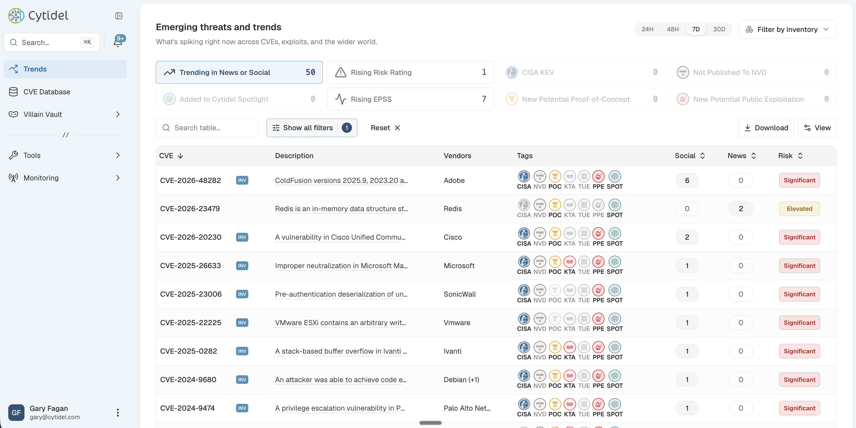
The trends page quick filters from classic Recon are now in the new platform — one click, live counts, and you can filter the whole page down to just your inventory.
A new Monitoring section
A new Monitoring section
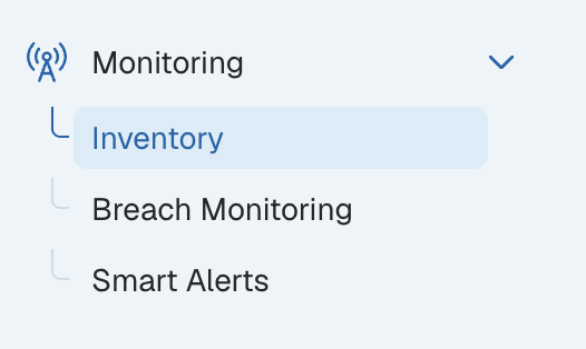
There's a new Monitoring section in the side menu, bringing together Inventory, Breach Monitoring, and Smart Alerts, which previously lived in different places. Everything about what you monitor and how you're alerted on it now sits in one place: your inventory defines what you care about, and breach monitoring and Smart Alerts watch it. Nothing to do on your end — log in as usual and it's all there.